Content Marketing Analysis with Python, Pandas, and Matplotlib

If you hang around marketing teams long enough, you’ll eventually hear someone say “We need more traffic!” — and someone else whisper “Actually, we need more conversions.”
Both people are right. And both people are guessing.
That’s where Python becomes a surprisingly friendly little microscope.
Not the scary, hardcore programming-language type microscope — more like: give me a CSV, let me poke at it, and let’s see who really moves the needle around here. We’ll load numbers, ask questions like children (“why is THIS higher than THAT?”), draw some colourful charts, and start replacing opinions with evidence.
Because at the end of the day, content marketing is a giant feedback loop.
We write → someone reads → something happens (or doesn’t) → we learn.
Python just lets us learn faster.
Which authors bring in readers vs. which ones actually convert?
Turns out they are not always the same people.
We visualized author performance using traffic + signups + conversion rate, then ranked them based on how efficiently they turned readers into signups. A log scale was used because some authors pulled in massive traffic while others were tiny — without log scaling, the small ones would look invisible. (Think of log scale like zooming out so everyone fits in one family photo.)
That one plot immediately sparked questions like:
- Why does Author A get all the eyeballs but fewer signups?
- Why is Author B punching above their weight on conversions?
- Should we support traffic-heavy authors with better CTAs?
- Should we study what the high-conversion writers are doing differently?
And that’s where things get fun. Because once you see patterns like this, you can’t unsee them.
## Author performance (log-scale plot) as a table (sorted by Users):

  Author    Users  Signups  Conversion_Rate_Percent
  Nathan     28813      494                     2.20
  Samuel      7622      133                     1.93
  Roger       7589      242                     2.25
  Adam        3166       36                     0.56
  Sarah       1028       24                     1.11
  Bret         589        6                     1.02
  Simon        558       15                     1.45
  Peter        122        8                     3.42
  Kyle          74        0                     0.00
  Douglas       53        0                     0.00
  Matt          21        0                     0.00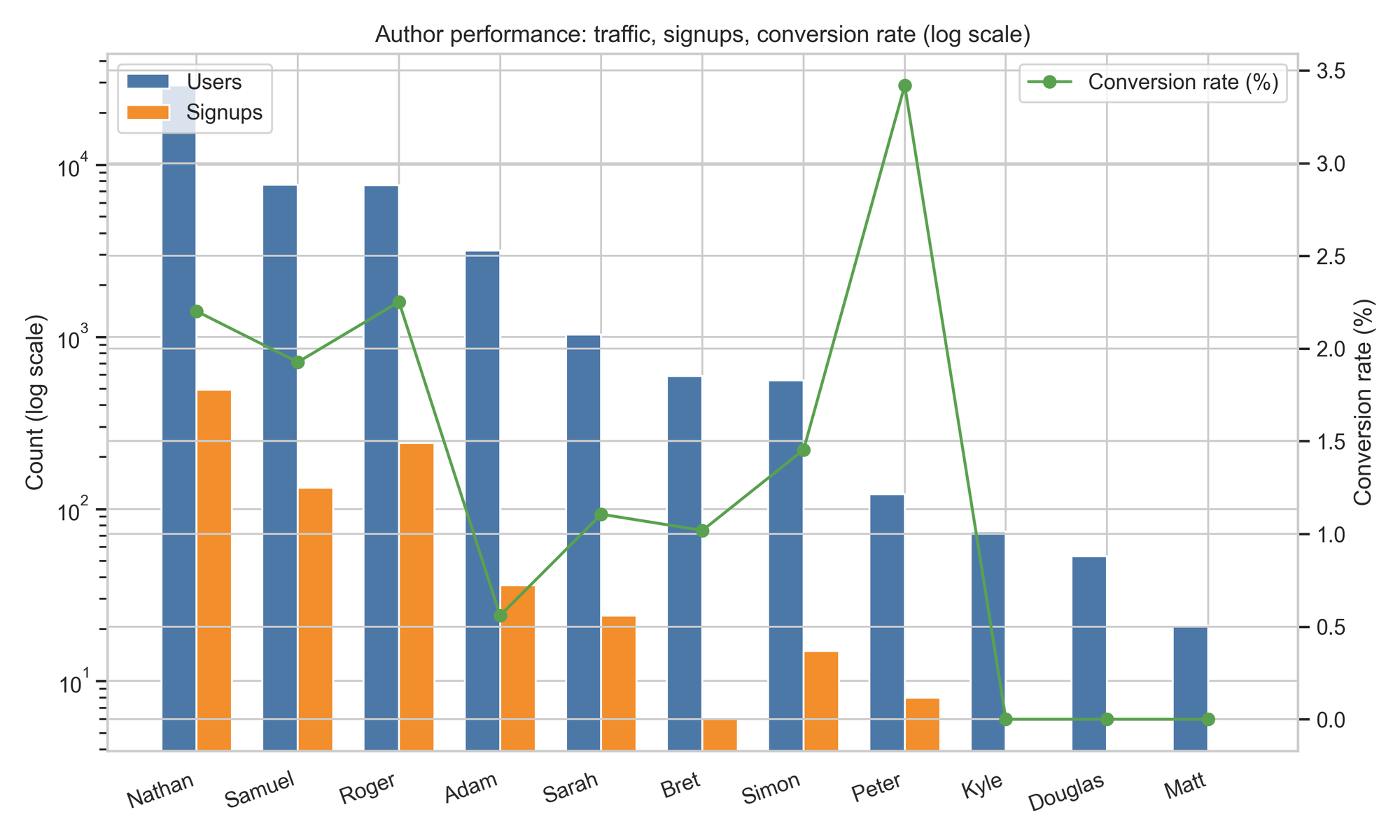
Most Efficient Author (Signups Per User)
This chart answers a fun question:
Who doesn’t just attract readers — but actually convinces them to sign up?
Peter clearly stands out. His conversion rate is way above the median, meaning whatever he’s doing — topic choice, CTA placement, writing style — it’s working. This is the kind of outlier you want to study and clone.
Right behind him, a few authors sit in the “good but not explosive” zone — solid conversion, decent engagement, room to scale. These are the ones where small tweaks (stronger CTAs, clearer takeaways, better bottom-funnel messaging) could push them over the top.
Then there’s the interesting middle: authors with high engagement but only average conversions. Readers stay, enjoy, scroll — but don’t act. That usually means the content is good, but the handoff to signup is weak. Fixable problem, high upside.
And finally, a tail of authors with low conversion and low engagement. Here, we’re not just tuning — we’re rethinking. Better hooks, sharper intros, more actionable framing.
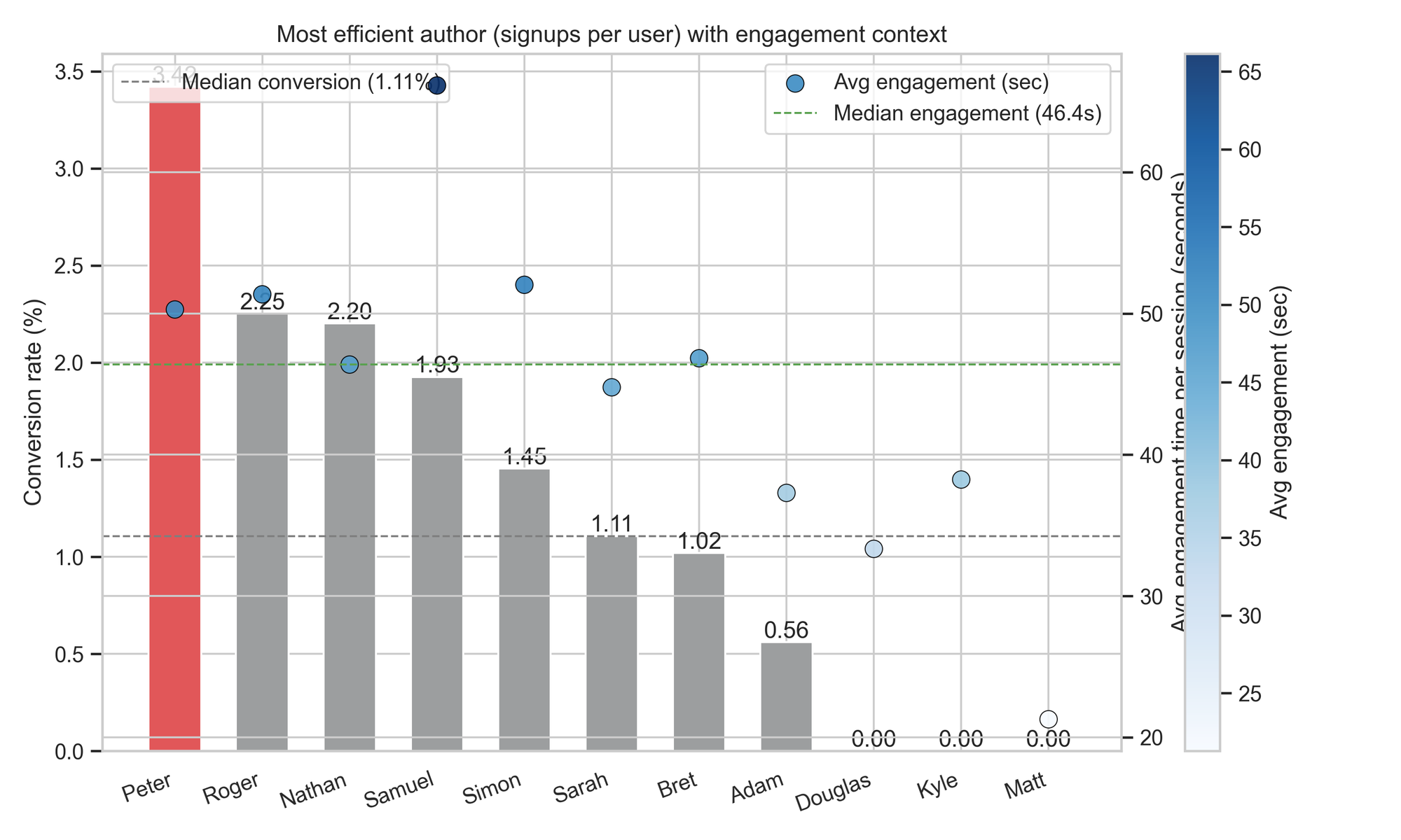
TL;DR
- Peter = the benchmark. Study → replicate → scale.
- High-engagement but median conversion = opportunity. People read, now nudge them further.
- Low-everything authors = rethink and rebuild.
One chart, four levels of insight — and now we know exactly where to experiment next.
Traffic vs Signups — Does More Traffic Mean More Signups?
This scatter plot answers a classic marketing question:
If we get more visitors, do we automatically get more signups?
The trend line slopes upward, which means traffic does help — more people visiting generally leads to more people signing up. But notice how the dots are widely scattered rather than tightly clustered. That’s an ELI5 way of saying:
Traffic matters, but it doesn’t guarantee results.
Some posts with ~1,000 users bring in solid conversions, while others with similar traffic barely move. A few posts even overperform — punching above their traffic weight.
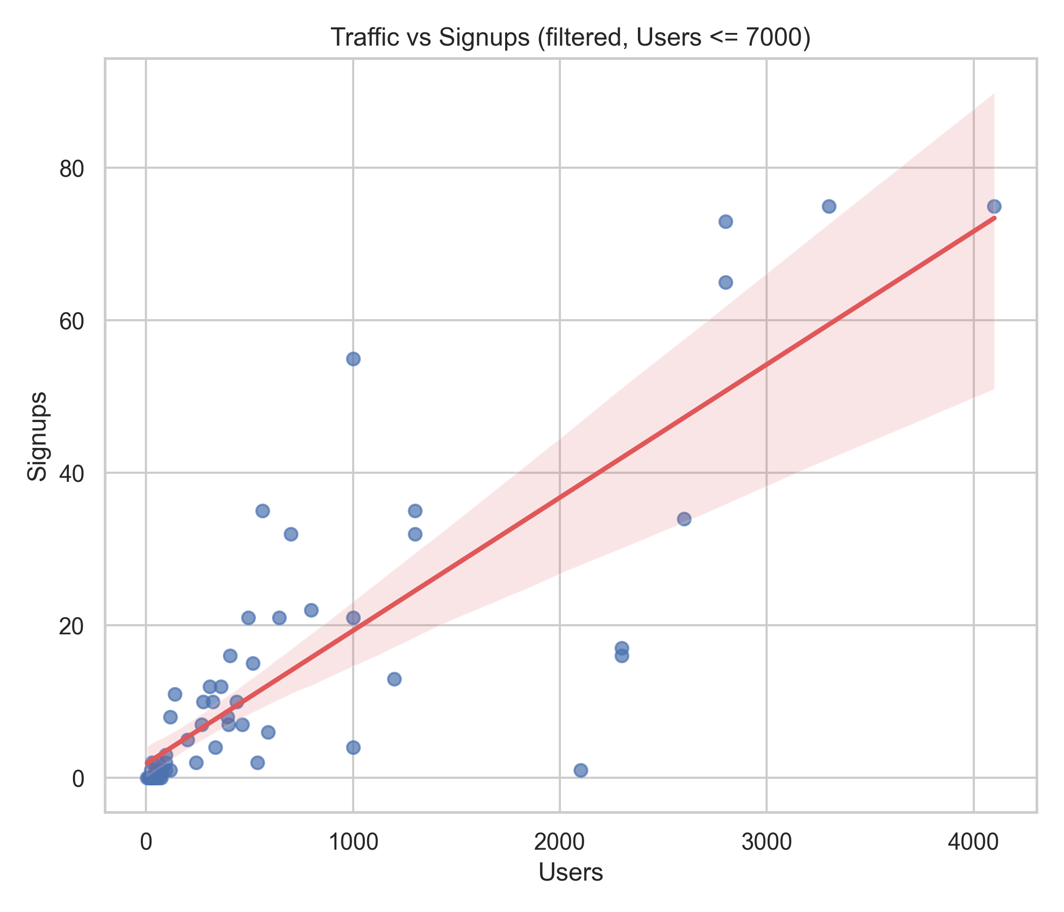
TL;DR insights
- More traffic = more chances, but it’s not a magic switch.
- Conversion still depends on what the visitor sees and feels once they land there.
- If acquisition is growing but signups are flat → the bottleneck is the content/CTA, not reach.
Traffic opens the door — conversion is what gets people to step through it.
Engagement vs Bounce — Who Keeps Readers, and Who Loses Them?
This bubble chart shows how “sticky” each author’s content is:
Do people stay and read, or do they bounce quickly and disappear?
Higher engagement + lower bounce = a great reading experience. These authors are holding attention, giving value, and leading readers deeper into the content. You can almost think of their writing as “magnetic.”
Then we have the opposite pattern — authors with short engagement times and high bounce rates. Readers land, skim, and leave. Not enough hook, clarity, or relevance.
Bubble size reveals another dimension: some authors attract large audiences but still suffer from bounce. That’s a big opportunity — a small UX/content fix here could have a huge impact.
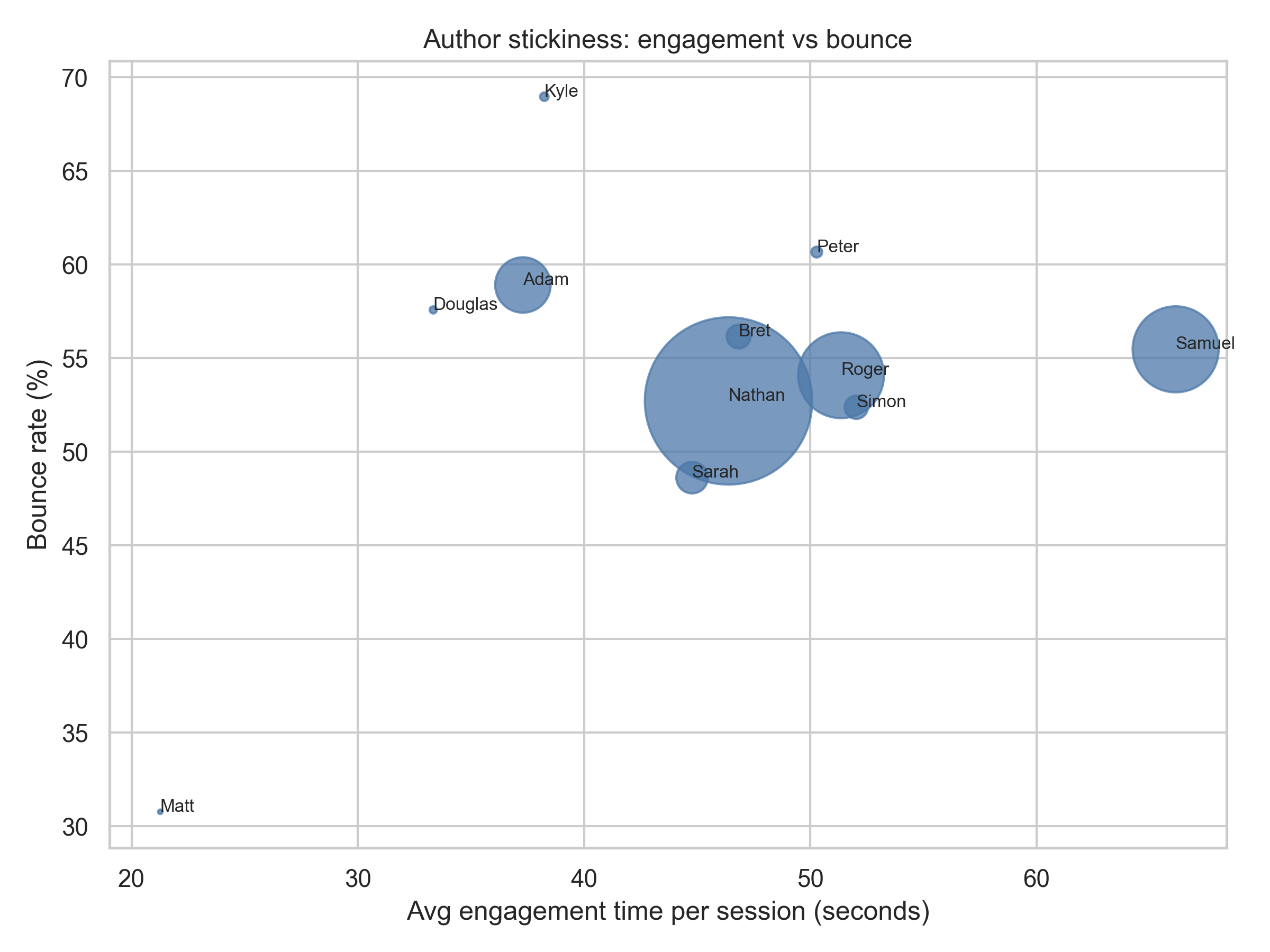
TL;DR insights
- High engagement / lower bounce = strong content-market fit.
- Heavy traffic + weak stickiness = optimization goldmine.
- Low-engagement authors need rewrites that grab attention faster.
Stickiness isn’t just about being read — it’s about being remembered and acted on.
Engagement vs Signups + Conversion — Does Reading Longer Lead to Action?
These two plots explore a common belief:
If people spend more time reading, will they eventually sign up?
The trend does slope upward — meaning longer engagement generally nudges signups and conversion higher. But it’s not a strong push. Plenty of posts with good engagement still produce modest conversions, and a few short-read posts convert surprisingly well.
In the left chart, bubble size and color show traffic. Some posts with large user volume also have strong signups — but others don’t, reminding us that attention alone doesn’t close the deal.
The right chart reinforces that pattern: engagement helps, but something else must carry the final step.
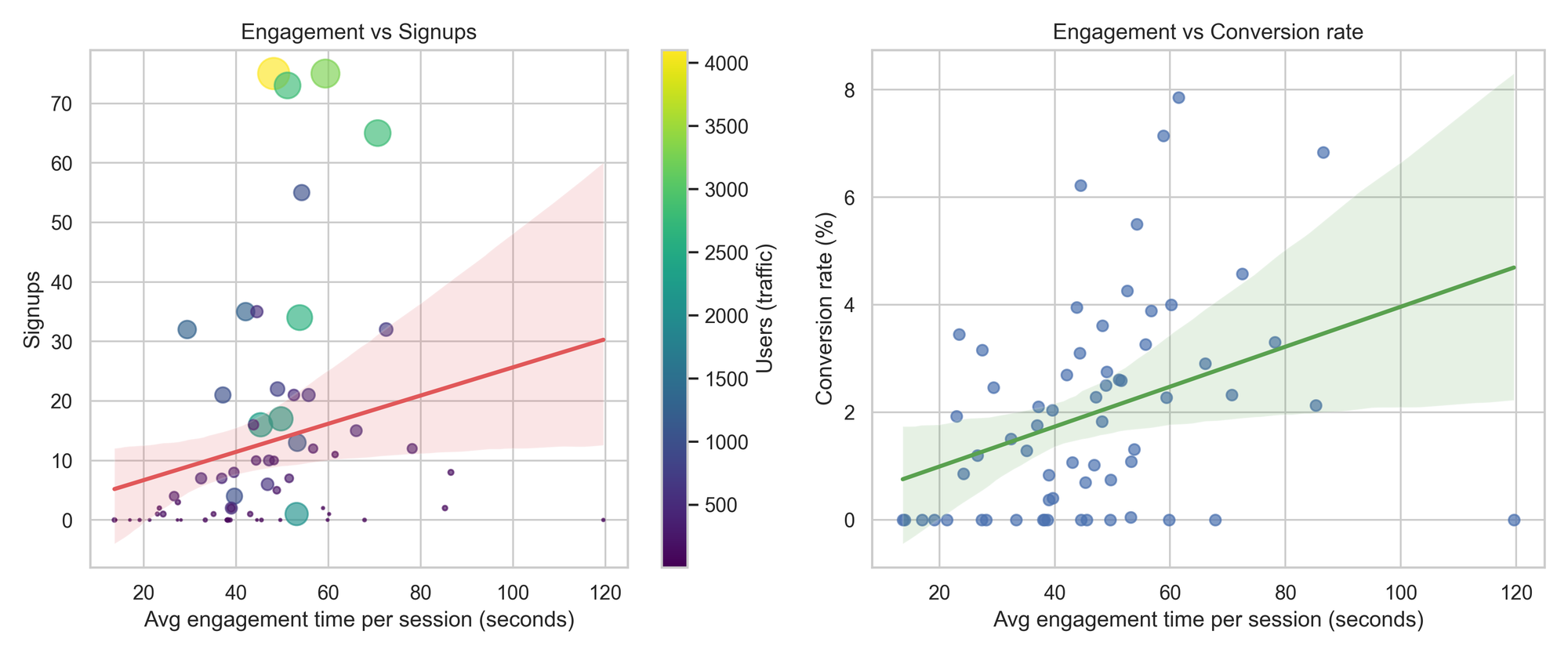
TL;DR insights
- More time on the page = slightly better signup odds (but only slightly).
- Traffic + engagement without conversion → CTA, topic, or offer misalignment.
- The real wins happen when engagement × conversion optimization work together.
People reading is good — people acting is better.
Posts Needing Conversion Uplift — Where Traffic Isn’t Turning Into Signups
This chart highlights a familiar pain point:
We’re getting visitors — so why aren’t they signing up?
Each dot is a blog post. The ones with lots of users but low signups (right side, below the red median line) are the real opportunity zone. These posts already attract attention — meaning SEO, topic choice, or distribution is working — but something in the post itself isn’t sealing the deal.
Color makes it clearer: darker / greener points convert better; lighter ones struggle. Many of those low-signup posts aren’t underperforming because of reach — they’re underperforming because the path to signup is weak.
These are the posts we should fix first:
They get more visitors than typical but convert worse than typical.
(above-median traffic, below-median conversion).

**Median benchmarks: ~274 users, 1.63% conversion.**

  Author   posts_needing_uplift  avg_conversion_rate_percent  avg_users
  Nathan                      3                         0.84     1933.3
  Adam                        2                         0.84     1569.5
  Roger                       2                         1.35      400.0
  Samuel                      2                         0.22     1550.0
  Bret                        1                         1.02      589.0
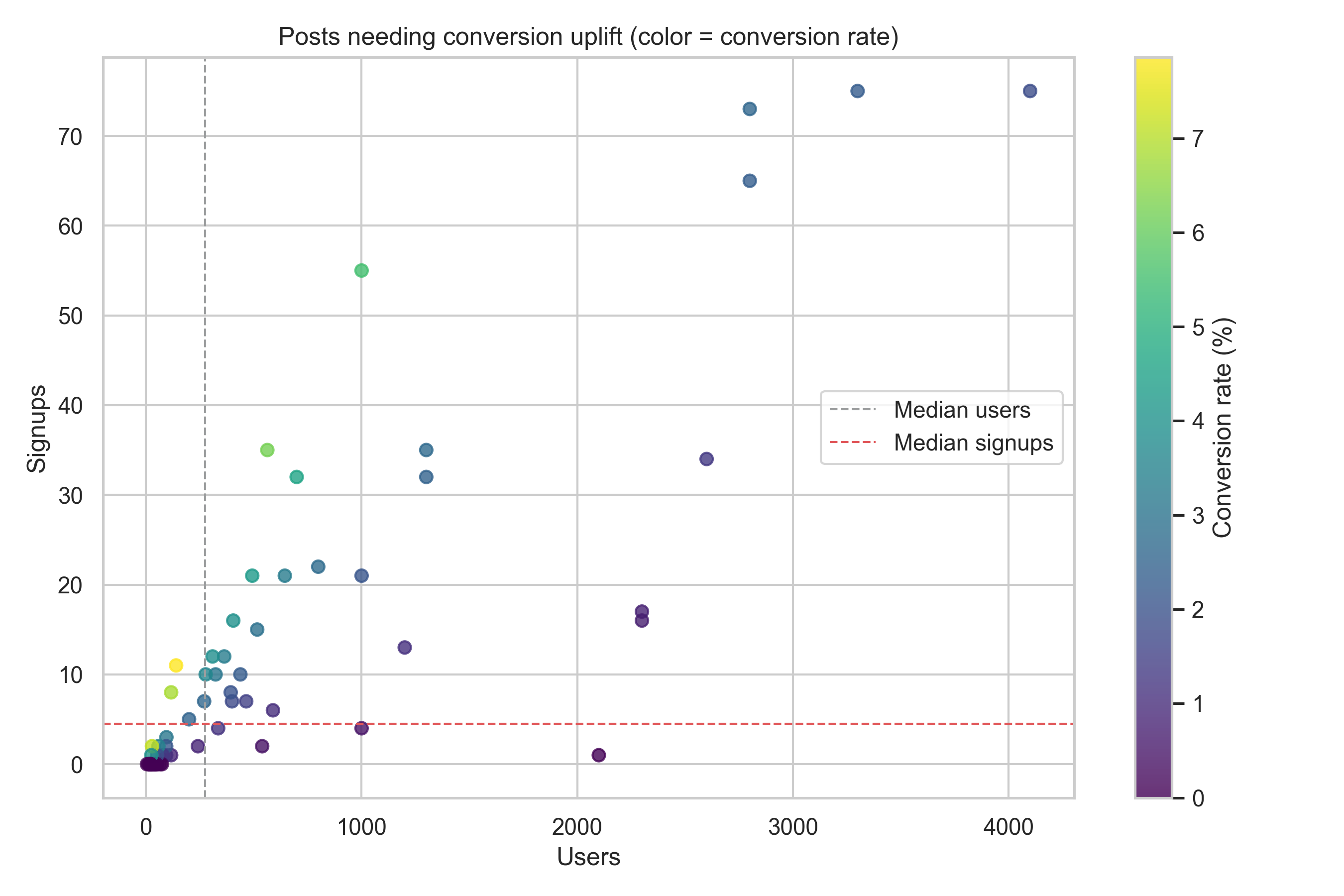
TL;DR insights
- High traffic + low signup = hottest optimization targets.
- Don’t push more distribution yet — fix the conversion leaks first.
- Test CTA placement, offer relevance, lead magnet messaging, and form UX.
These posts don’t need more eyes — they need better persuasion.
Author Quadrant: Traffic vs Conversion — Who to Scale vs Who to Fix
This chart splits authors into four useful buckets using median traffic and median conversion as boundaries. In simple terms:
Who brings lots of readers?
Who actually converts them?
And who does both — or neither?
The top-right quadrant (high traffic + high conversion) is where the real engines live. Nathan, Roger, Samuel — they’re pulling volume and converting above average. These authors deserve amplification: more distribution, more internal links, maybe even more content with similar angles.
Top-left quadrant (low traffic + high conversion) includes Peter — a standout. He converts exceptionally well but isn’t getting the same reach. Scaling his distribution could produce disproportionate returns.
Bottom-right (high traffic + low conversion) is where leverage hides. These authors already have attention — but they’re leaking conversions. Stronger CTAs, tighter messaging, and better offer alignment could turn them into top-right performers.
Bottom-left (low traffic + low conversion) is the rebuild zone. These authors need both reach and conversion support: better intros, clearer structure, deeper intent targeting.
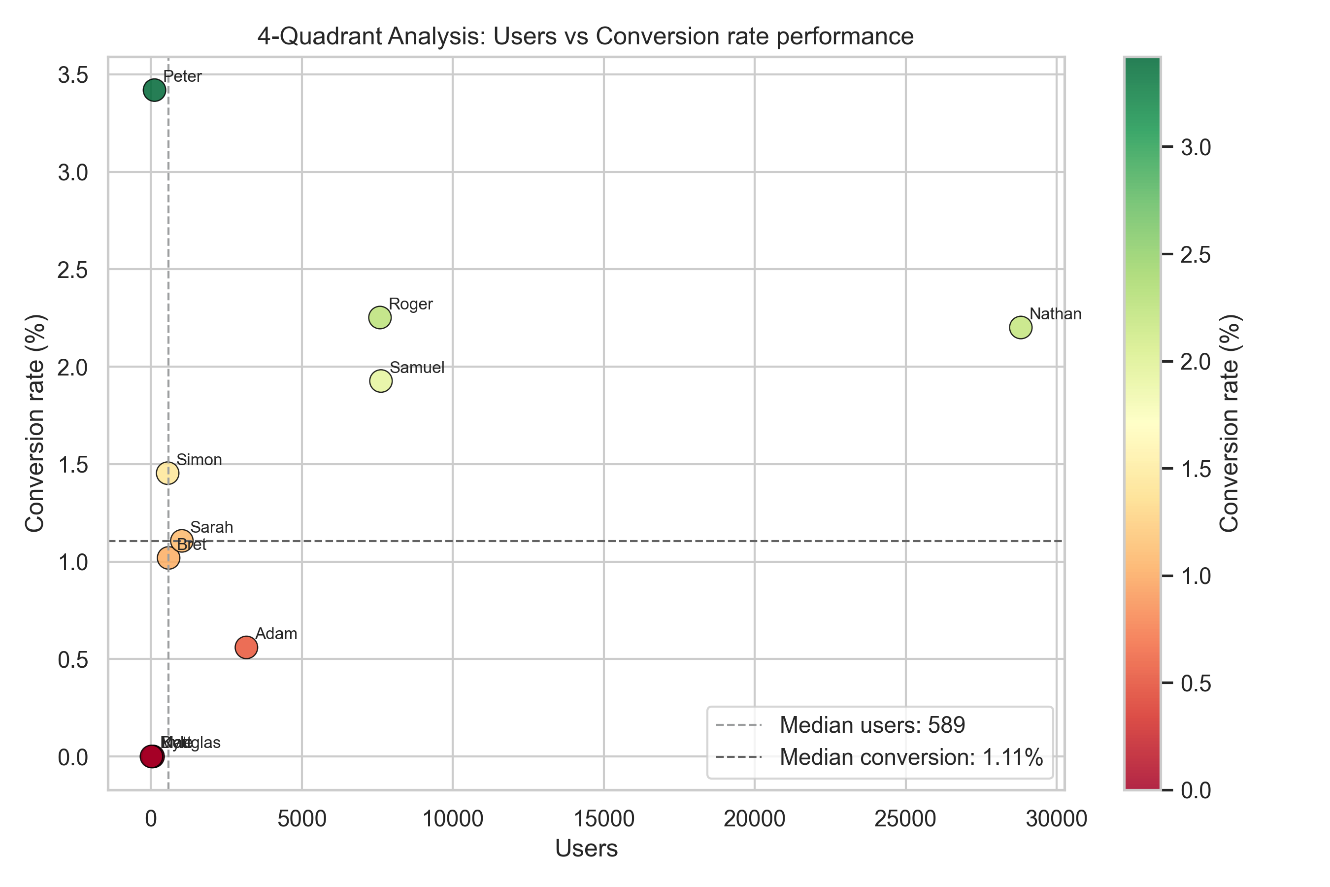
TL;DR insights
- Top-right = scale. Double down with promotion & repurposing.
- Top-left = boost reach. Great converters deserve more visibility.
- Bottom-right = fix conversion. High upside, fastest wins.
- Bottom-left = restructure. Rethink angles, hooks, and CTAs.
One quadrant view → four clear action paths.
Post Quadrant: Traffic vs Conversion — The Easiest Wins Live in the Bottom-Right
This chart maps every post by how many users it attracts (traffic) and how well it converts them. The median lines split everything into four quadrants, revealing where posts are quietly winning — and where they’re leaking opportunity.
The shaded zone (high traffic, low conversion) is the high-leverage area. These posts already pull readers in, but they don’t persuade them to take the next step. That means the SEO/topic engine is working, but the conversion engine isn’t firing. A small tweak here could move the needle fast.
Up top, we have low-traffic but high-conversion posts — tiny, high-quality machines. These ones deserve more visibility. And posts above both medians are best-in-class: good reach and solid conversion.
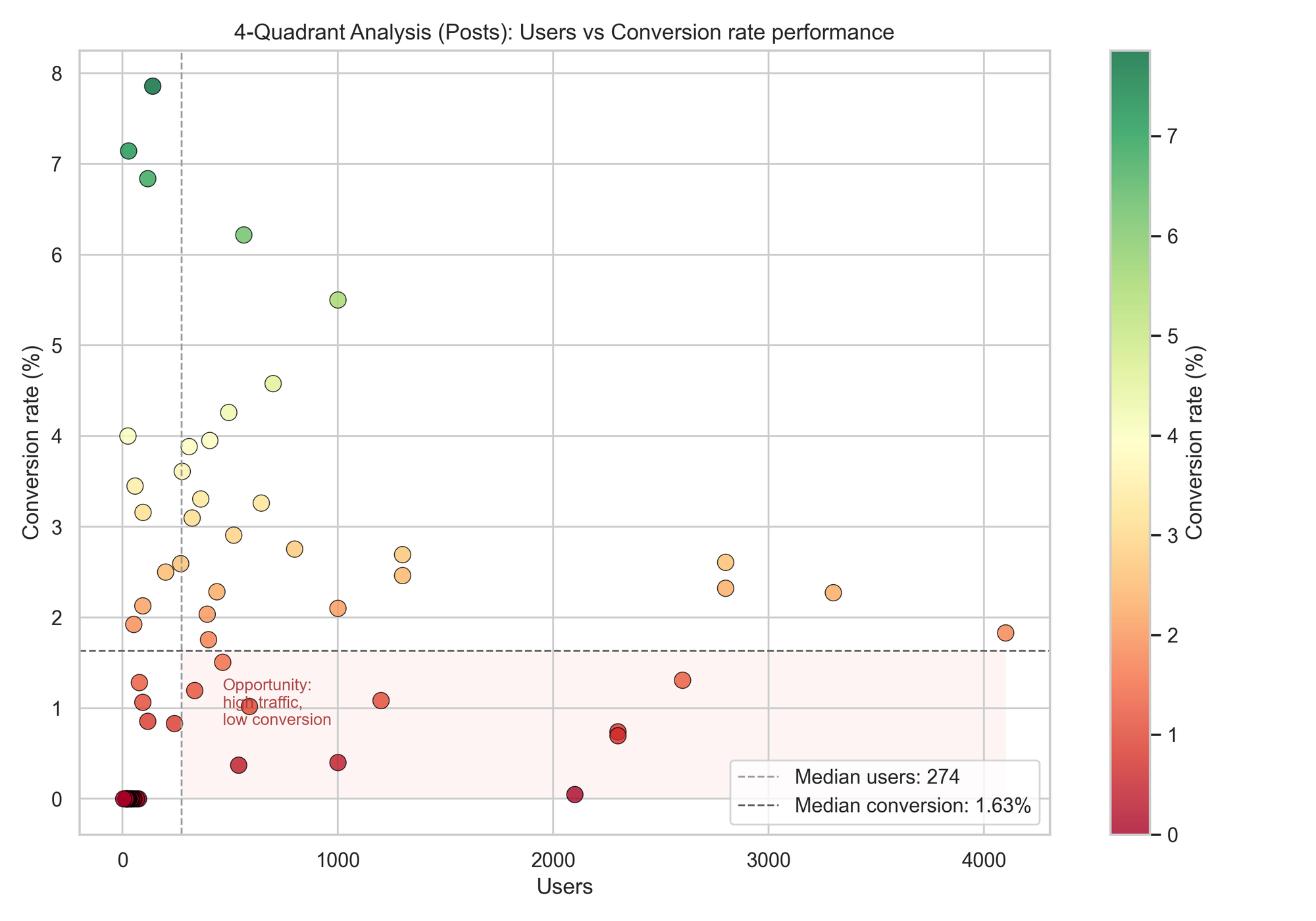
TL;DR insights
- Bottom-right = biggest upside. High reach, weak conversion — fix these first.
- Top-left = scale candidates. They convert well, they just need more traffic.
- Top-right = winners. Promote, repurpose, amplify.
- Bottom-left = rebuild. Rework positioning, hook, CTA clarity.
Traffic shows interest. Conversion shows impact.
The sweet spot is a post that does both.
Correlation: Engagement vs Conversion — How Strong Is the Relationship?
This chart tries to answer a simple question:
If people spend more time reading, are they more likely to sign up?
The trend line slopes upward, meaning longer engagement tends to increase conversion, but not dramatically. The Pearson r value is 0.36, which sits in the “moderate correlation” zone — helpful, but not a guarantee.
🧸 ELI5: What does Pearson r = 0.36 mean?
- Imagine engagement and conversion holding hands.
- 0 means they never hold hands.
- 1 means they walk perfectly in sync.
- 0.36 means they’re connected, but one can still wander off sometimes.
So yes — engagement helps, just not strongly enough to rely on it alone.
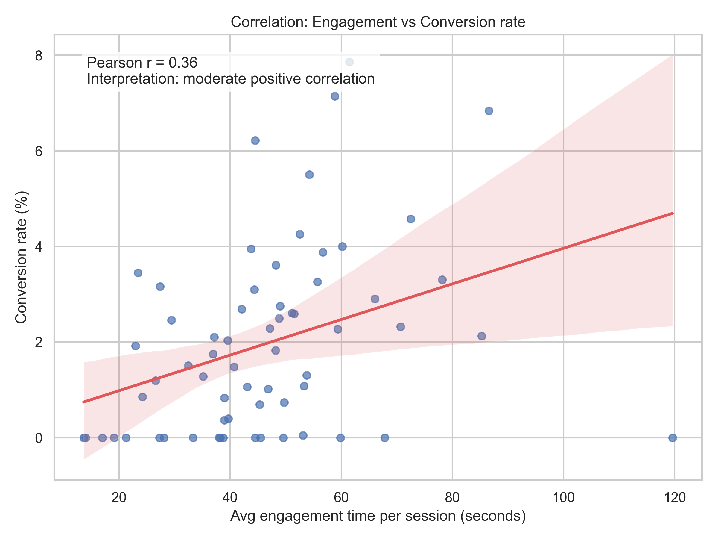
TL;DR insights
- More time spent reading = slightly better chance of signing up, not a rule.
- Improving engagement is good, but CTAs, intent, and offer clarity drive the final conversion.
- Think of engagement as warming the room, but conversion elements close the door.
Engagement opens the window; conversion decides if a visitor climbs through.
Engagement vs Conversion with Bounce Overlay — Where Good Content Leaks Signups
This chart adds a third dimension to the story: not just do people stay and do they convert, but also do they bounce?
The engagement–conversion correlation is still modestly positive (r ≈ 0.36), meaning longer attention helps — a little.
Bounce, however, doesn’t follow that pattern (r ≈ −0.31, weakly negative). In plain English:
People spending more time don't always mean fewer bounces — bounce is influenced by something else.
Maybe intent mismatch, maybe slow page load, maybe CTA placement friction — but not just the article quality by itself.
Those high-engagement + high-bounce posts are the “quick wins.”
They hold attention, but bleed conversions — meaning a small CTA or UX fix could flip them fast.
From the quick-win extraction table, authors like Nathan and Samuel have multiple posts in this zone. Fixing just their CTAs, offer alignment, or scroll-based triggers could unlock immediate signup lift without needing more traffic.
Here are “quick win” posts by author (same filter as the engagement_conversion_bounce_interaction plot: engagement ≤ 200s). Criteria:
  engagement ≥ median (~44.93s), conversion < median (~1.63%), bounce ≥ median (~51.41%) → posts that keep people around but bleed
  conversions and show higher bounce (good candidates for CTA/offer/UX fixes).

  Author   quick_win_posts  avg_conversion_rate_percent  avg_engagement_seconds
  Nathan                 2                         0.72                    47.5
  Samuel                 2                         0.02                    86.4
  Adam                   1                         1.31                    53.8
  Bret                   1                         1.02                    46.8
  Roger                  1                         0.00                    49.6
  Sarah                  1                         0.00                    67.8

  Focus first on authors with more quick-win posts (Nathan, Samuel), then address the singles. These posts already hold attention but
  aren’t converting; tighten CTAs, align offers to intent, and reduce bounce friction.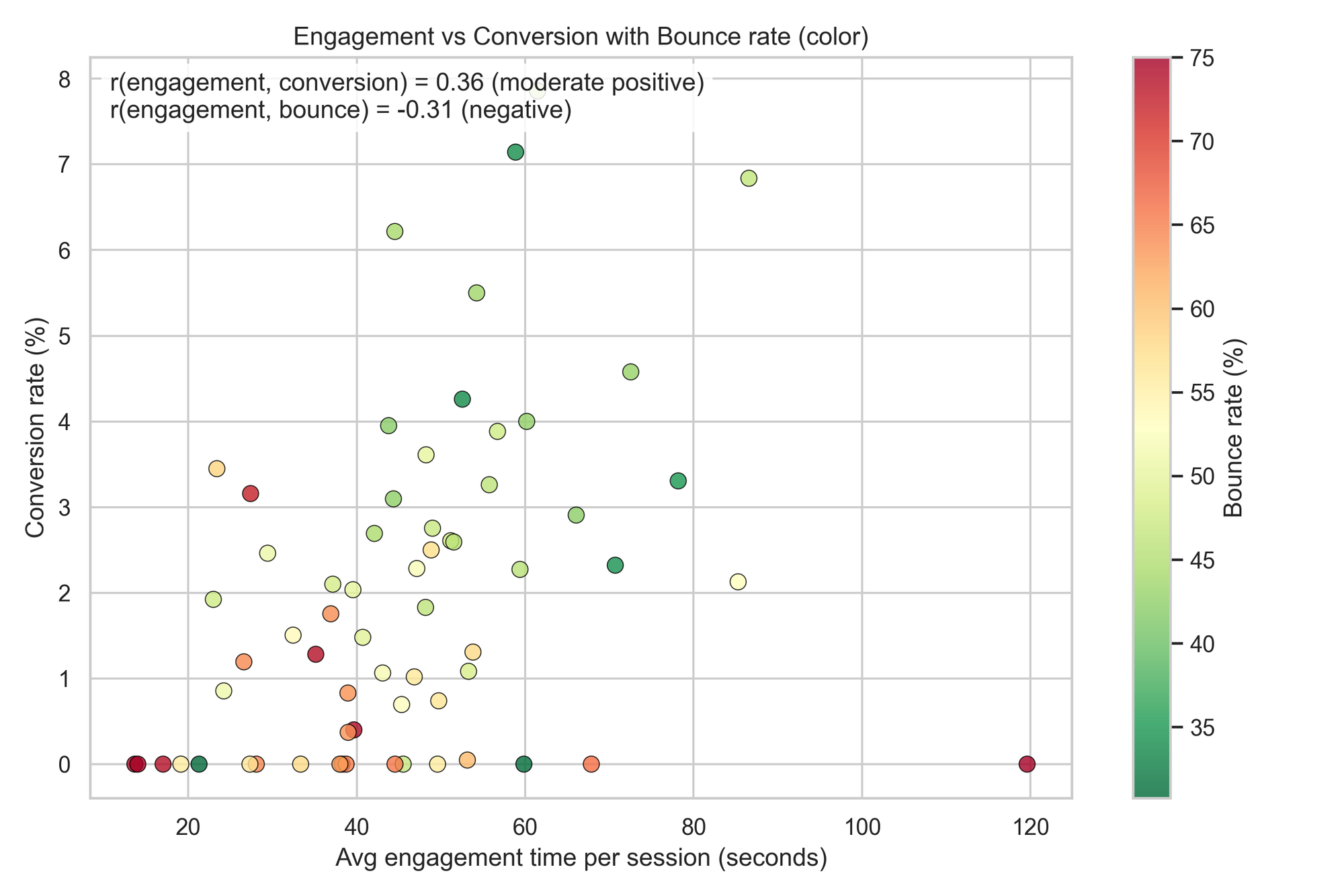
TL;DR insights
- Engagement helps conversion, but weakly — it’s an assist, not the finisher.
- Bounce doesn’t track engagement — friction or intent mismatch likely drives drop-offs.
- Prioritize high-engagement, low-conversion posts first — they’re the easiest wins.
These posts already earned the reader’s time — now we just need to earn the click.
Quality–Volume–Outcome: Does Better Content Actually Convert Better?
This plot blends two quality signals—engagement (good) and bounce (bad)—into one score, then checks if that score predicts conversion. The trend line slopes upward with a moderate correlation (r ≈ 0.49), meaning higher-quality posts generally convert better, though not perfectly.
🧸 ELI5: What’s a Z-score?
Think of z-score as a ruler that measures how far from normal something is:
- 0 = totally average
- +1 = better than most
- –1 = worse than most
Here, we converted engagement and bounce into z-scores so they’re on the same scale, then combined them like:
quality = how long people stay (good) – how many leave early (bad)
Higher quality score = stickier content that doesn’t lose readers too soon.
Bubbles show traffic volume, so the big ones are high-reach posts. If a big bubble sits at average quality but low conversion, that’s a prime optimization target—huge upside with minimal effort.
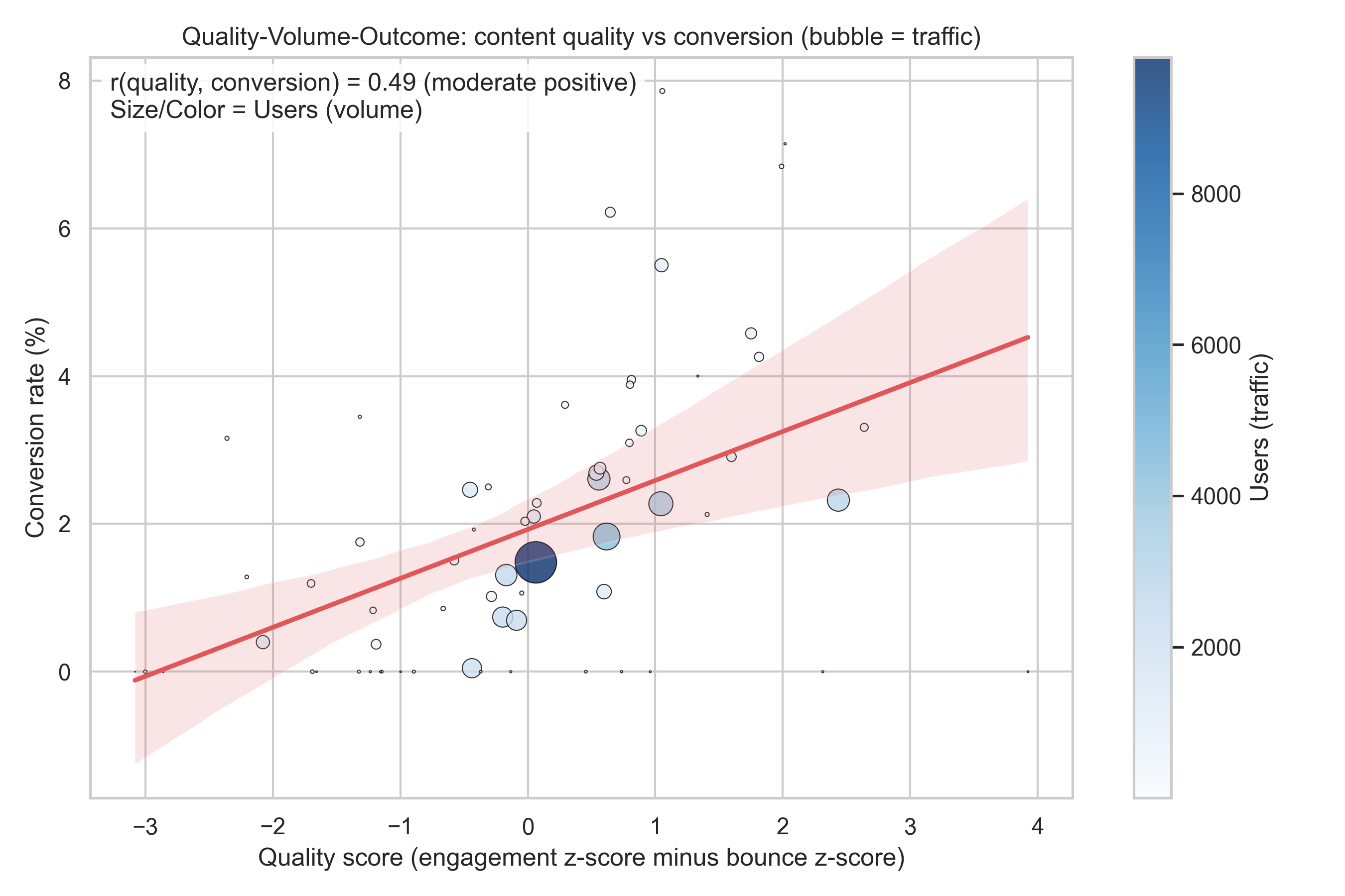
- X-axis: quality score (higher = higher engagement and lower bounce relative to average).
- Y-axis: conversion rate.
- Bubble size/color: traffic volume (users).
- Red line: overall trend between quality and conversion.
Where to look:
- Right side, below the trend or below median conversion: high-quality posts that aren’t converting enough—prime CRO targets.
TL;DR insights
- Better quality → generally better conversions, though not guaranteed.
- Big bubbles with average quality & low conversion = fastest win zones.
- Lift engagement and reduce bounce, but pair it with strong CTAs for full impact.
Quality warms the lead. CRO closes the deal.
Bounce + Traffic → Conversion — Traffic Doesn’t Win by Itself
This plot asks a simple but revealing question:
Do popular posts convert better — or do low-bounce posts convert better?
The answer is clear in the correlations:
- r(traffic, conversion) ≈ 0.04 → basically no relationship
More eyes don’t automatically mean more signups. - r(bounce, conversion) ≈ −0.55 → strong negative
When fewer people bounce, conversion rises noticeably.
Color makes it visible — greener dots (lower bounce) tend to sit higher on conversion, regardless of traffic volume. Meanwhile, some highly visited posts convert poorly simply because people leave early.
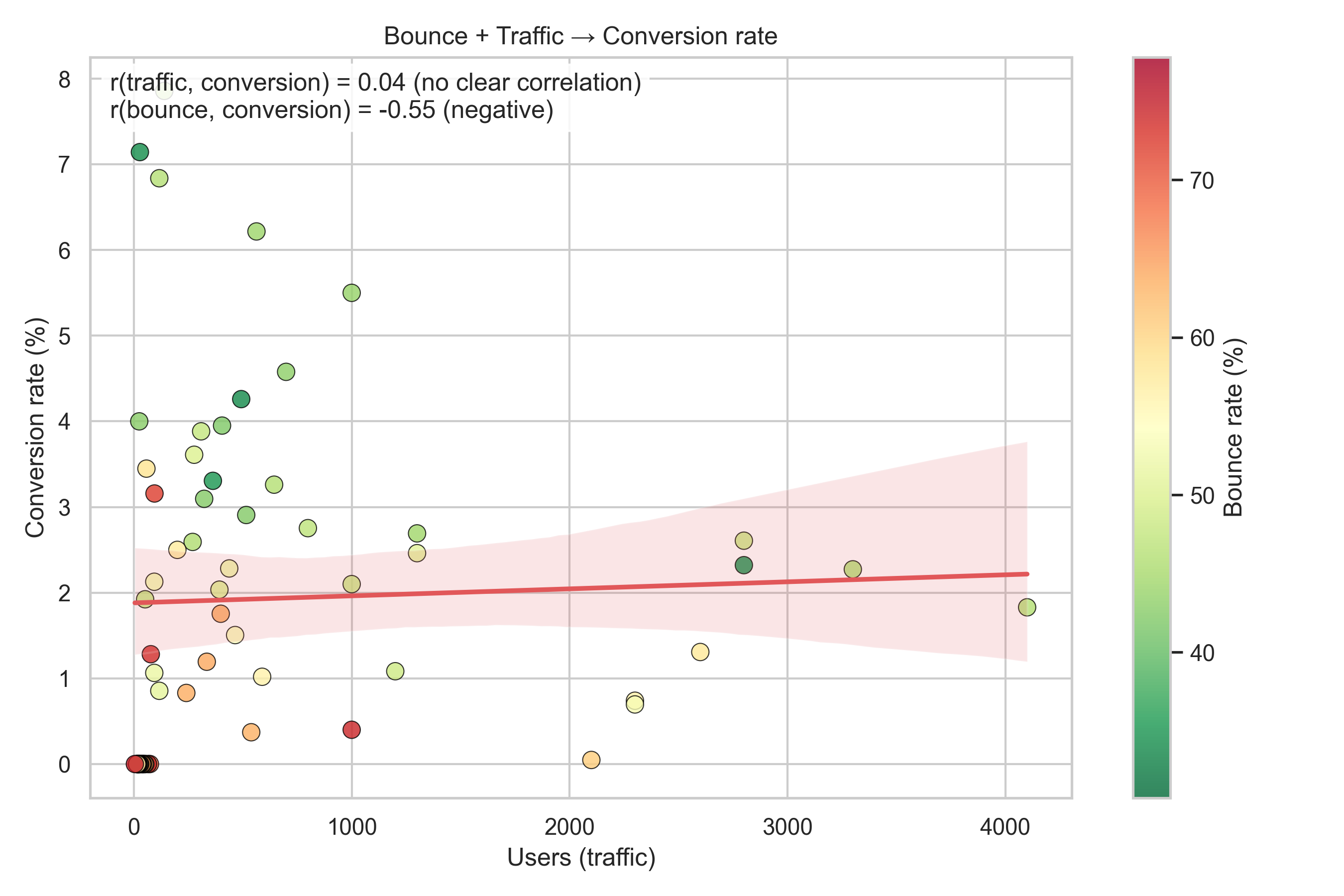
TL;DR insights
- Traffic doesn’t guarantee conversions — quality of retention matters more.
- Bounce is the stronger lever to pull; lower bounce → better odds of signup.
- Start with high-traffic but high-bounce posts — biggest returns, fastest results.
You don’t need more visitors — you need fewer escape routes.
Learnings:
Python didn’t just give us charts — it gave us x-ray vision. We now know which authors convert, which posts leak signups, where engagement helps, and where bounce quietly steals growth.
The patterns are simple: traffic opens the door, quality keeps people in the room, and conversion design guides them forward. With a few smart tweaks — better CTAs, clearer intent match, smoother reading paths — even average posts can become high-performing ones.
And the fun part? Everything here is measurable, repeatable, and endlessly testable. Now you’re not guessing. You’re iterating with evidence.