Google Search Console Low Hanging Fruits Analysis for SEO: Using Python, Pandas, Regression, and Bayesian libraries.

This project provides a comprehensive Python-based exploratory data analysis (EDA) of Google Search Console data to identify SEO optimization opportunities. The analysis focuses on "low-hanging fruit" - pages that rank in positions 11-30 and have potential for quick traffic gains.
The idea is straightforward: use a Python-based exploratory data analysis (EDA) workflow to scan your Search Console data and spot SEO opportunities. But don’t worry—the goal here isn’t to turn marketers into data scientists. The goal is to make the thinking clearer, faster, and more confident, using analysis as a flashlight.
The “Positions 11–30” Sweet Spot
Let’s talk about the range this project focuses on: average rankings between 11 and 30.
That’s not an arbitrary slice. It’s a particularly interesting zone because it’s where pages often live when they’re already relevant, already indexed, already earning impressions—but not yet getting the clicks they deserve. In other words: Google is already giving you a chance, just not a prime one.
And that’s why marketers love this category once they see it clearly. Because moving a page from position 18 to position 9 can feel dramatically more achievable than moving something from position 68 to position 9.
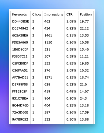
Sample Data
Below is the sample dataset we exported for this project. The original keywords have been masked/redacted to protect the source.
INTRODUCTION TO REGRESSION ANALYSIS for SEO
Regression analysis is a statistical method that examines the relationship between a dependent variable (the outcome we want to predict) and one or more independent variables (the factors that may influence the outcome).
Key Concepts:
The dependent variable is the outcome you want to predict or explain—meaning it changes in response to other factors. In an SEO context, common dependent variables include clicks (how many times users click your search results), CTR or click-through rate (the percentage of impressions that turn into clicks), and position (your ranking in search results).
Independent variables are the inputs you use to predict the dependent variable. They are treated as the “explanatory” factors in the model. In SEO analysis, examples include impressions (how many times your result is shown), position (when you are trying to predict CTR), and clicks plus impressions (when you are trying to predict position).
Regression analysis focuses on the relationship between these variables by estimating how changes in the independent variables are associated with changes in the dependent variable. For example, it can help answer questions like how increasing impressions affects clicks, how position impacts click-through rate, or whether you can predict search position based on clicks and impressions.
Why Regression Analysis Matters for SEO: Regression is valuable because it helps identify which factors most strongly influence search performance and quantifies their impact in measurable terms. Instead of relying on intuition, you can translate changes in metrics into expected outcomes (for instance, estimating how many additional clicks might result from a CTR improvement). This supports data-driven optimization strategies and enables forecasting future performance based on current trends and relationships in your SEO data.
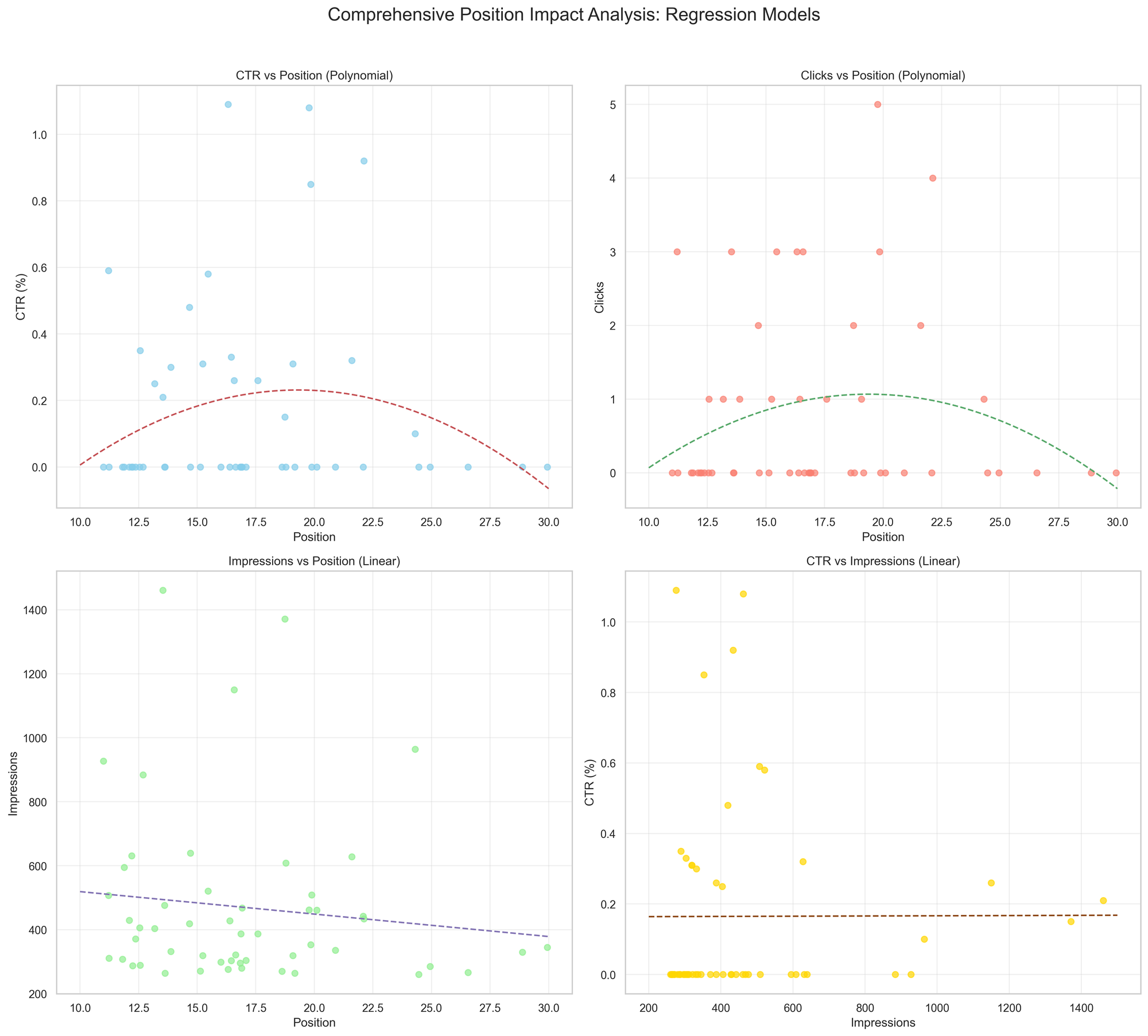
Comprehensive position impact analysis:
It shows, at a glance, how moving up or down the rankings changes CTR, clicks, and impressions —and how visibility relates to CTRs(so you can see the payoff of better positions.)
- Top-left: CTR vs. rank. Points show actual CTR by position; curved fit shows
CTR peaks on higher ranks and fades as rank worsens. - Top-right: Clicks vs. rank. Points show clicks by position; curved fit shows
clicks drop as rank moves down. - Bottom-left: Impressions vs. rank. Points show how many times you were seen;
straight line shows impressions usually decline as rank worsens. - Bottom-right: CTR vs. impressions. Points tie visibility to CTR; straight
line shows whether getting seen more tends to raise or lower CTR in this
data.
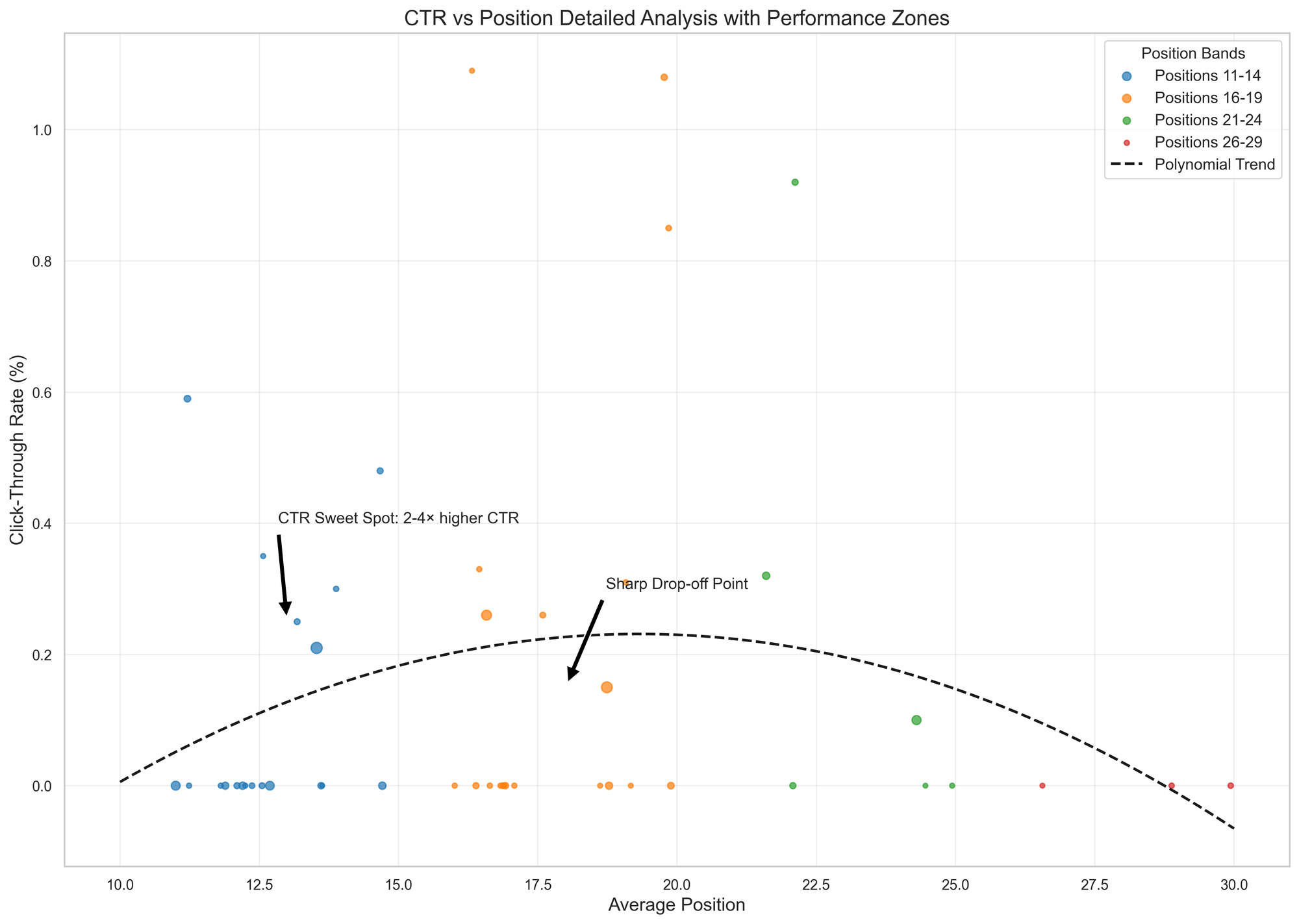
Impact of Average Position of CTR
It’s a bubble scatter of CTR vs. rank by four color-coded rank bands (11–15, 16–20, 21–25, 26–30), with bigger bubbles for more impressions and a dashed curve showing the overall CTR-vs-position pattern.
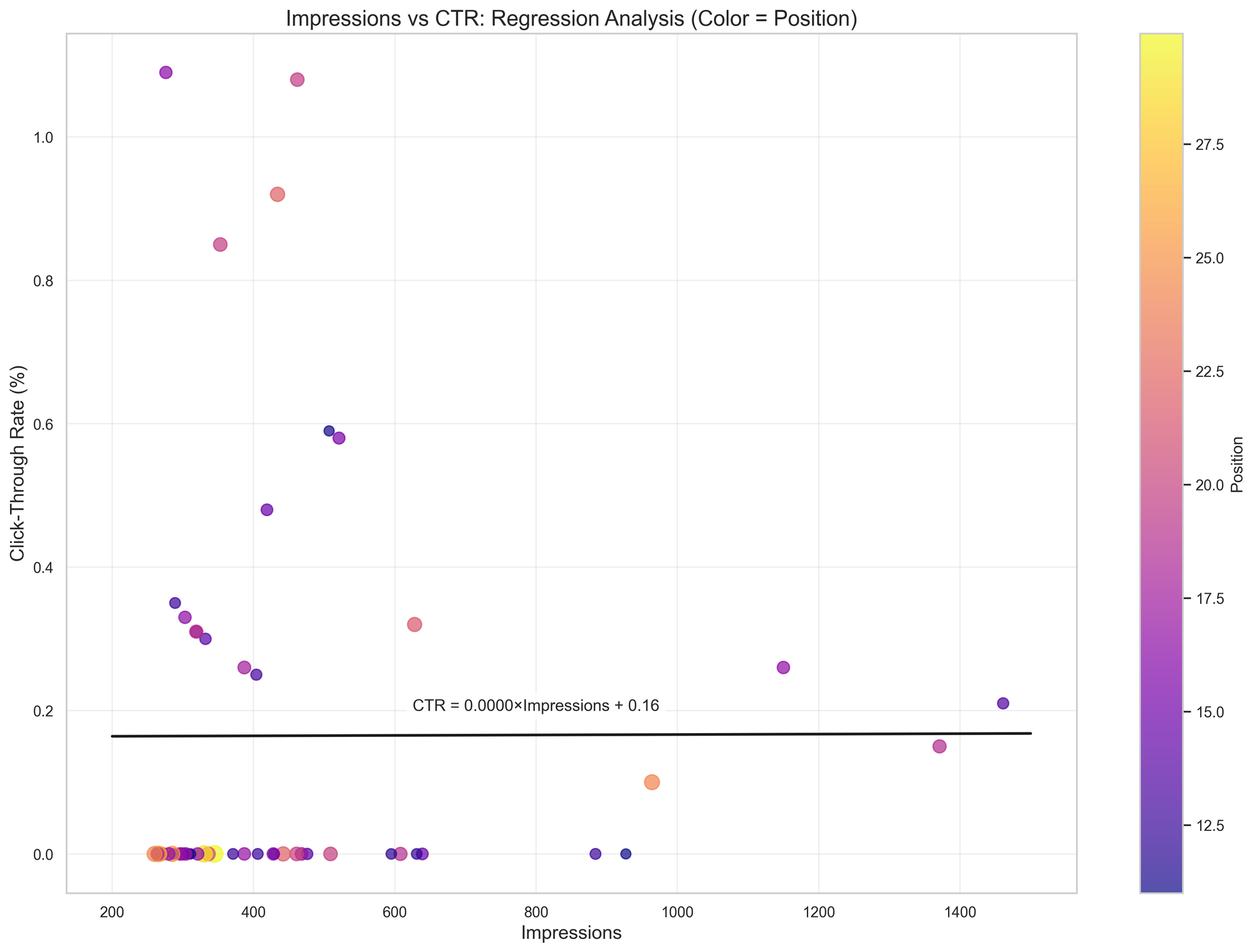
Impressions vs. CTR: Regression analysis
It’s CTR vs. how often you show up(impressions). Dots = queries; color/size = rank. The black line shows the overall trend—do more impressions typically coincide with higher (or lower) CTR?
For a marketer, in this particular data, the intercept line basically says “how often you’re shown(impressions) isn’t driving CTR here.” The flat slope means more impressions don’t automatically raise or lower CTR, so you shouldn’t expect volume alone to fix click-through.
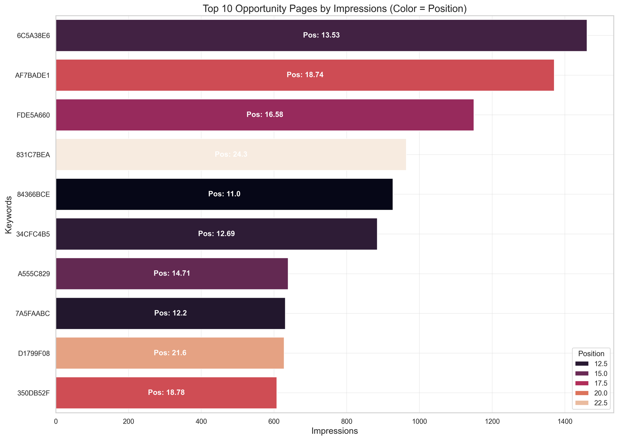
Top 10 keywords to optimize for based on impressions alone(low hanging fruits and quick wins)
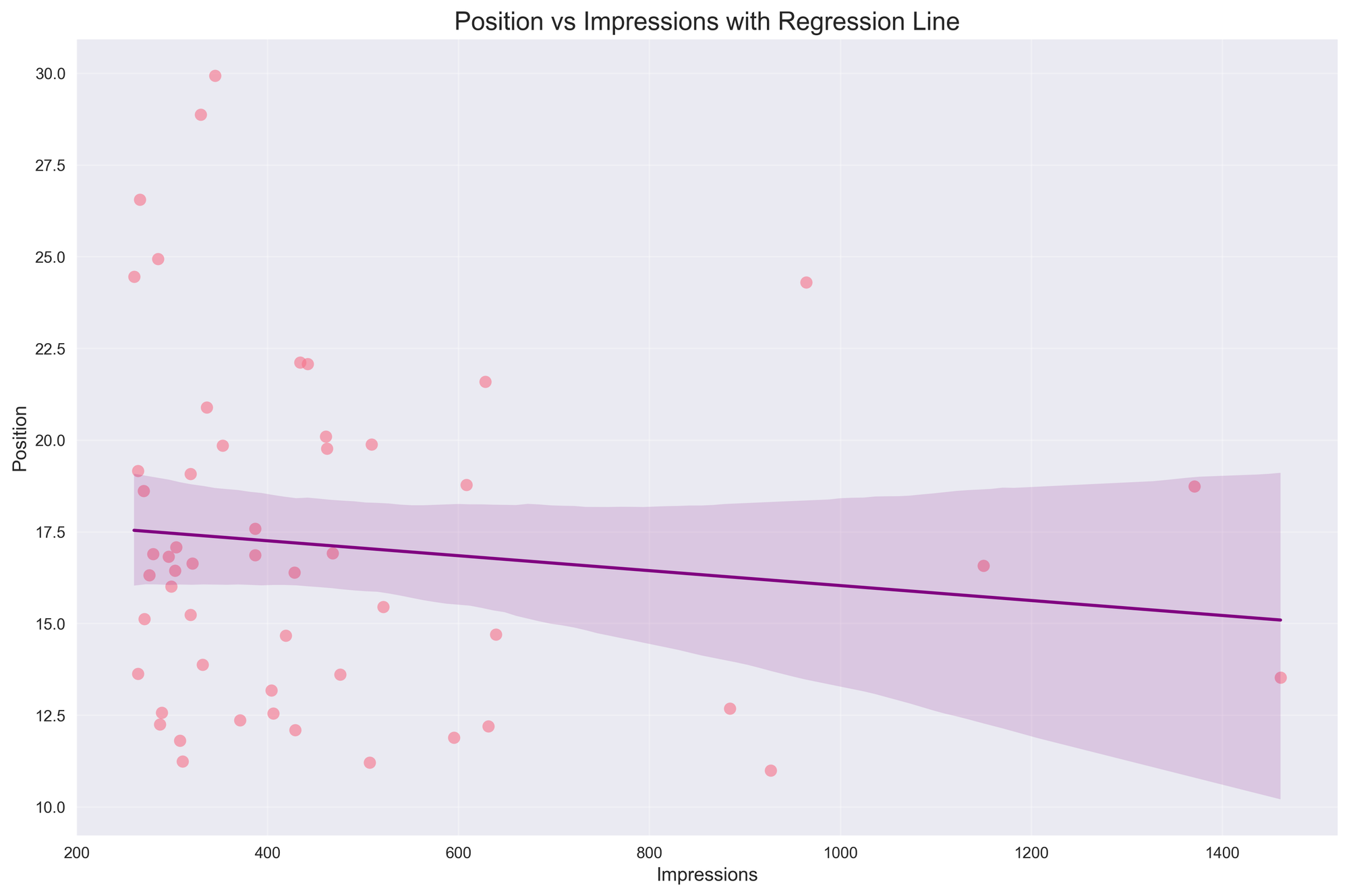
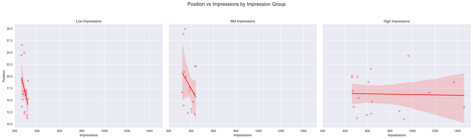
Position vs Impression: Relationship
Trend: The plot fits a straight regression line (purple) through the points to show the overall direction—whether more impressions tend to come with better (lower) positions or not.
Reading the line: A downward slope means higher impression volume is associated with better ranks; a flat slope means little relationship in this sample.
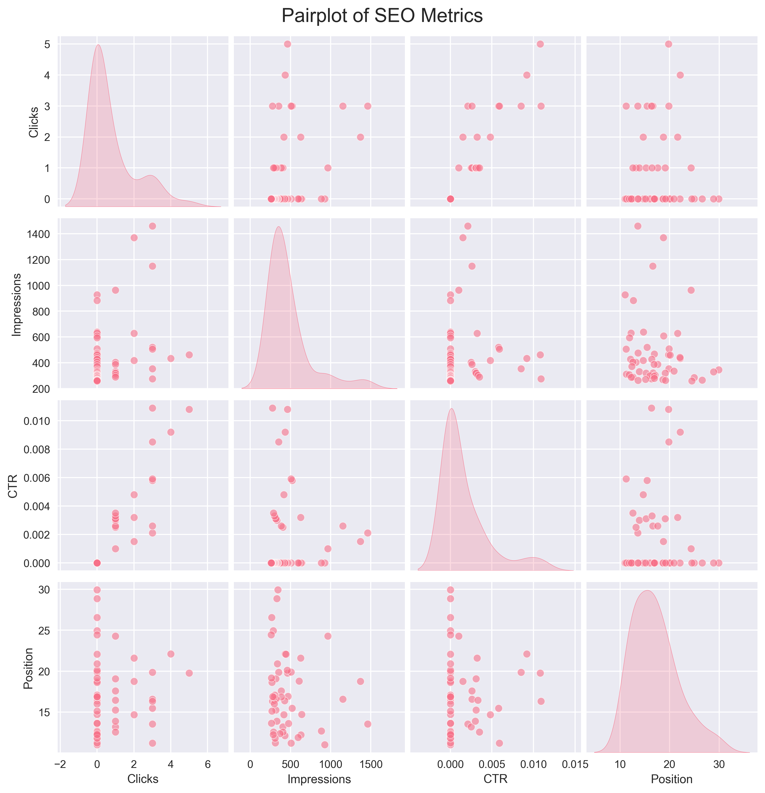
Pairplots of SEO metrics: Clicks vs. CTR vs. Impressions
It’s a grid of small charts showing how each metric relates to every other one, plus the distribution of each metric on the diagonal—use it to eyeball which pairs move together (or don’t) and to spot any oddball points.
Bayesian Hierarchical Analysis
INTRODUCTION
This hierarchical analysis examines how SEO performance metrics vary
across different impression levels. By grouping keywords into Low, Mid,
and High impression categories, we can uncover patterns and insights
that would be missed in aggregate analysis.
IMPRESSION GROUPING: Keywords were divided into three impression groups:
- Low: < 319.0 impressions
- Mid: 319.0 - 458.0 impressions
- High: > 458.0 impressions
GROUP STATISTICS
----------------
                 Impressions                          ...       CTR    Clicks
                       count        mean         std  ...       std      mean sum
Impression_Group                                      ...
Low                       19  287.947368   19.392077  ...  0.002699  0.368421   7
Mid                       16  382.750000   42.008729  ...  0.003092  0.750000  12
High                      18  736.777778  318.016566  ...  0.002967  1.222222  22

[3 rows x 9 columns]
KEY INSIGHTS
-----------
1. POSITION PATTERNS:
   - Low impression group: Average position = 17.07
   - Mid impression group: Average position = 18.13
   - High impression group: Average position = 16.28
   - Higher impression keywords tend to have better (lower) positions

2. CTR PATTERNS:
   - Low impression group: Average CTR = 0.001
   - Mid impression group: Average CTR = 0.002
   - High impression group: Average CTR = 0.002

3. IMPRESSION-CLICK RELATIONSHIP:
   - Low impression group: 7.0 total clicks
   - Mid impression group: 12.0 total clicks
   - High impression group: 22.0 total clicks

4. PERFORMANCE VARIABILITY:
   - Position variability is highest in: Low impression group
   - CTR variability is highest in: High impression group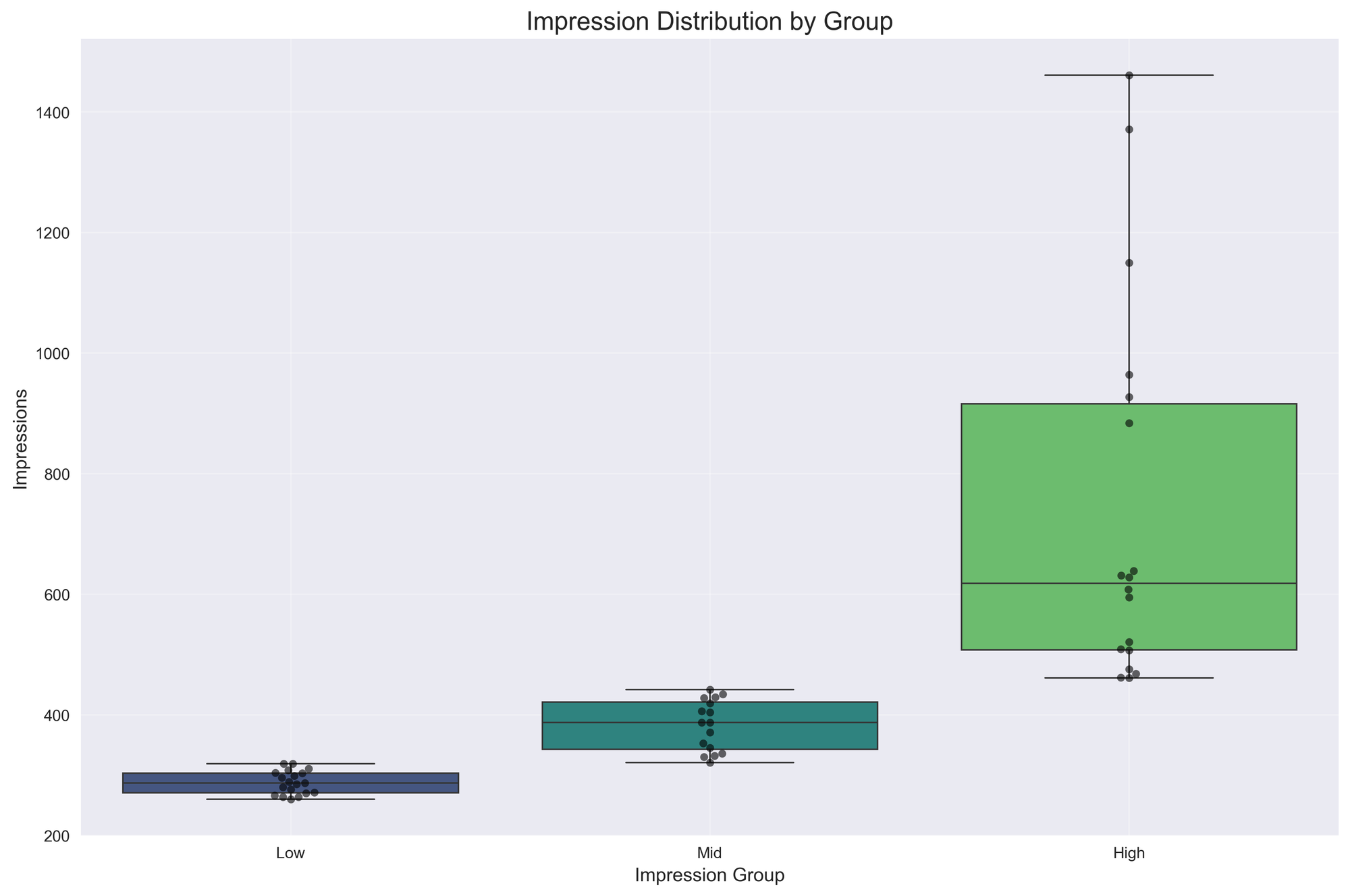
Compare how rank relates to impression volume separately for Low, Mid, and High impression segments. Read it like: in each segment, does getting more impressions coincide with better or worse ranks? A downward red line means higher impressions go with better rank; flat means little relationship; upward would mean more impressions despite weaker rank.
The Hidden Gold on Page 2: Turning High-Impression Keywords into Traffic
This analysis shows that many of your “next wins” are already getting impressions but not clicks. By focusing on the page‑2 and page‑3 SERP sweet spot (positions 11–25), you can unlock meaningful CTR gains without major content rewrites—just by running basic SEO sanity checks and optimizations. Combine that with strategic internal linking and a few authority boosts, and those high‑impression, low‑click queries can quickly turn into consistent traffic drivers.