Why Not Plain and Simple Websites?
Why not build websites that are nothing more than plain text? Remove animations, videos, pop-ups, and heavy CSS and the message stands alone. Visitors see the promise, the benefits, the features, and the price—nothing else.

The Power of Simplicity
0:00
/72.803125
Why not build websites that are nothing more than plain text? Remove animations, videos, pop-ups, and heavy CSS and the message stands alone. Visitors see the promise, the benefits, the features, and the price—nothing else.
Simplicity: A simple website presents information clearly—promise, benefits, features, pricing—without any distractions.
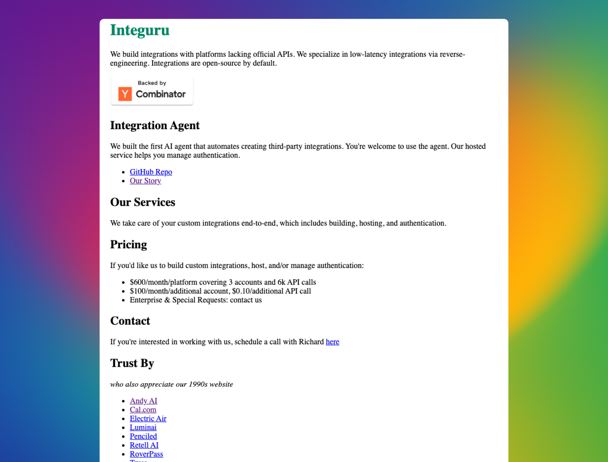
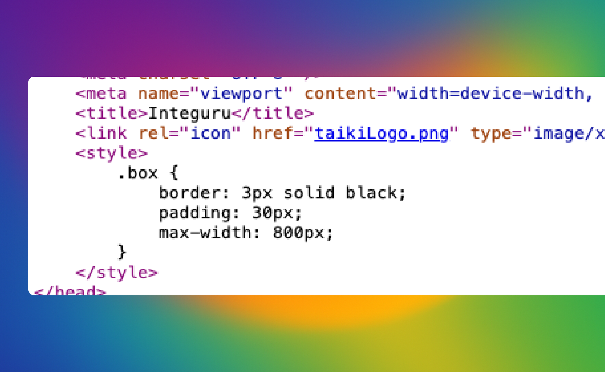
Example: Integuru.ai
- Extremely simple: plain text, only three lines of CSS
- Content: All essentials included—promise, pricing, GitHub repo, contact form, five case studies
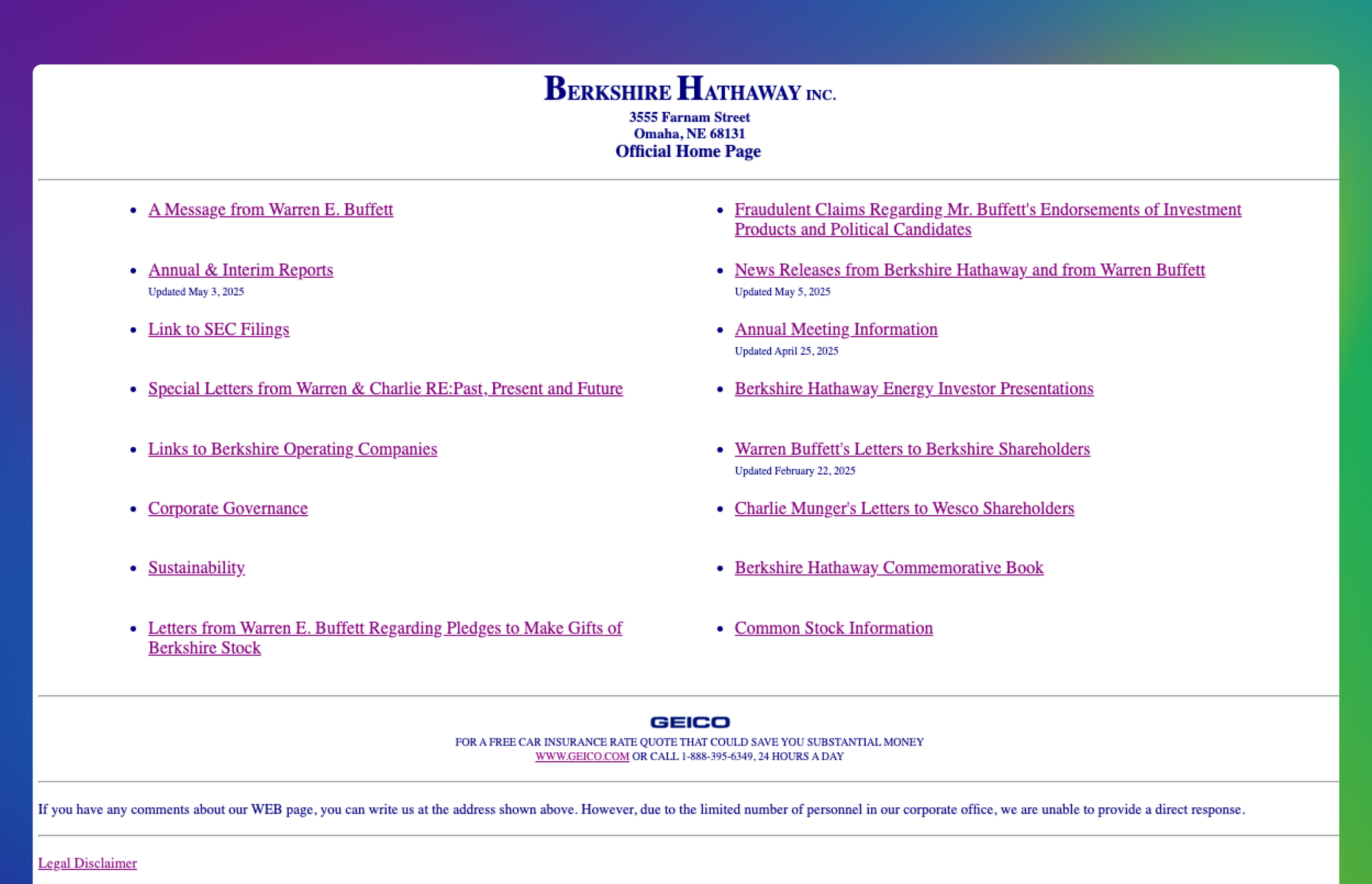
Comparison: Berkshire Hathaway
- Multi-billion dollar company
- Website: plain text, white background, about 15 links—no extra design, no fluff
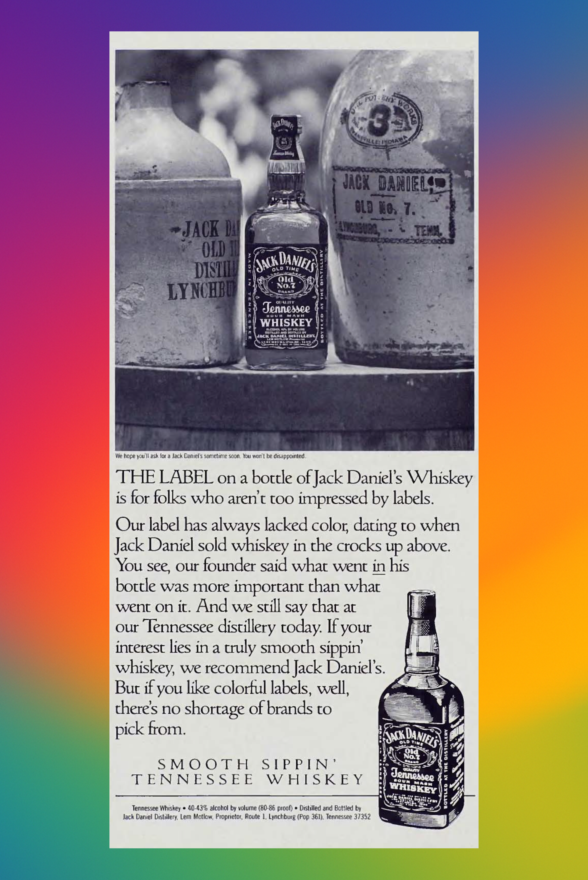
Analogy: Old Jack Daniel’s Ad
- While competitors focused on fancy labels, Jack Daniel’s kept things simple—the product inside was what mattered.
The ad:
THE LABEL on a bottle of Jack Daniel's Whiskey is for folks who aren't too impressed by labels. Our label has always lacked color, dating to when Jack Daniel sold whiskey in the crocks up above. You see, our founder said what went in his bottle was more important than what went on it. And we still say that at our Tennessee distillery today. If your interest lies in a truly smooth sippin' whiskey, we recommend Jack Daniel's. But if you like colorful labels, well, there's no shortage of brands to pick from.
Key Thought: Simplicity communicates effectively. Content and clarity can matter more than complex design. So, why isn’t this approach more common?